 Inbox Spy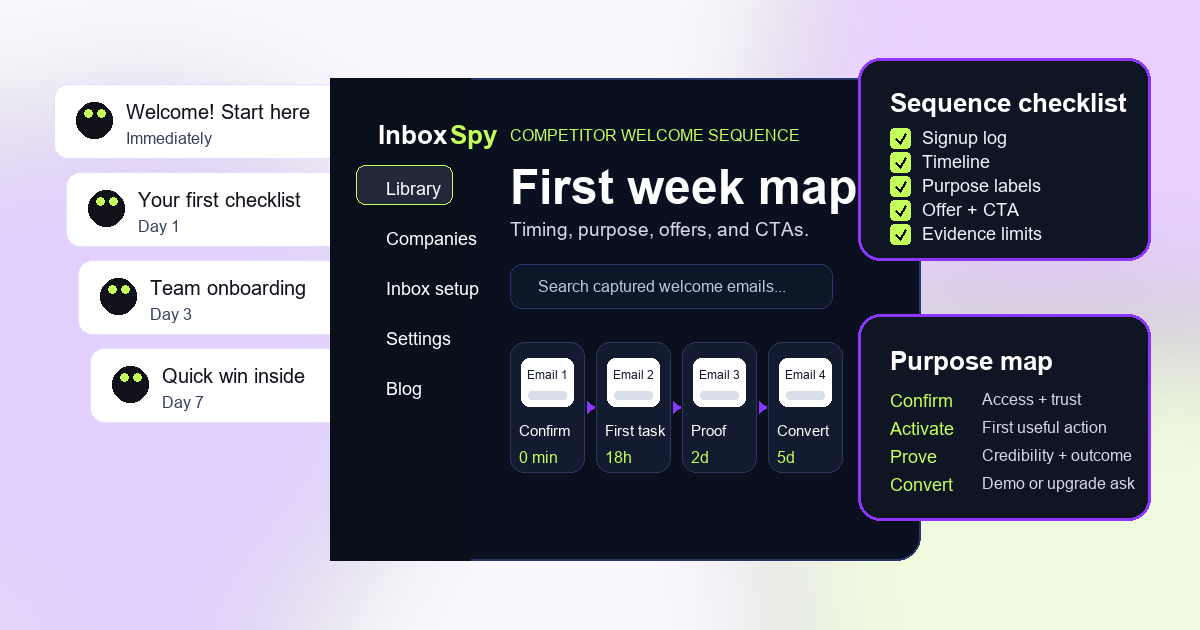
Why competitor welcome email analysis is different
A single welcome email can show tone, positioning, and the first call to action. A welcome sequence shows the whole early relationship. It reveals how a competitor moves from recognition to education, from education to activation, and from activation to a commercial ask.
That sequence view matters because teams often judge onboarding from isolated examples. One email may look aggressive in a swipe file, but feel reasonable after two educational emails. Another email may look helpful on its own, but become repetitive when the same proof point appears four times in one week.
The goal is not to copy the sequence. The goal is to understand the decision logic behind it. What friction does the competitor address first? How long do they wait before asking for a demo, upgrade, download, or purchase? Which promises repeat? Which user actions seem to change the next message? Those answers can produce better onboarding tests for your own product.
Start with a clean signup log
Every competitor welcome email analysis starts before the first email arrives. Create a signup log so the team knows exactly what triggered the sequence. Without that context, you cannot tell whether an email came from a newsletter signup, a free trial, a webinar form, a pricing-page visit, or a product action.
The signup log does not need to be complicated. Record the competitor, signup URL, date, time, tracking address, country if relevant, plan selected, form fields completed, confirmation steps, and any actions taken after signup. If you clicked an onboarding checklist, invited a teammate, added a product, or ignored the account completely, write it down.
This log protects the analysis from false certainty. If a competitor sends no second email after two days, that might mean the journey depends on product usage. If they send a sales email after a pricing-page form, that is different from receiving the same email after a newsletter signup. The log keeps those differences visible.
Build the welcome sequence timeline
After emails arrive, map them in order. The first view should be a timeline, not a gallery. For each message, capture the arrival time, subject line, purpose, primary CTA, and the previous action that may have influenced it.
A seven-day timeline is usually enough for a first pass. Some SaaS onboarding sequences continue for 14 or 30 days, but the first week often reveals the brand's activation priorities. For ecommerce and media brands, the welcome journey may move faster and mix education with promotion earlier.
Do not compress the timeline too quickly. Timing is part of the strategy. "Email 2 arrived 18 hours after signup" is more useful than "Email 2 arrived next." If you later compare three competitors, timing differences often become one of the strongest insights.
Label the purpose of each message
Welcome emails usually serve one main purpose, even when they contain several links. Label that purpose in plain language. Is the message confirming access, teaching the category, driving setup, proving credibility, asking for a sales conversation, pushing an offer, or moving the subscriber into a regular newsletter?
Purpose labels make the sequence readable. A competitor may send five emails, but the pattern might be simple: confirm, activate, educate, prove, convert. Another may skip activation and go straight from confirmation to sales. That difference is more useful than a list of subject lines.
When the purpose is unclear, note that too. A confusing welcome email is a finding. It may suggest the competitor is trying to serve too many audiences in one message, or that the sequence was assembled from campaigns rather than designed as a journey.
Compare offers, proof, and CTAs
Once timing and purpose are mapped, compare what the competitor asks the subscriber to do. The CTA is the visible action, but the offer is the reason to act. A welcome email might ask users to "complete setup," but the offer is really a faster path to first value. Another might ask for a demo, with the offer being a custom recommendation.
Track whether the sequence uses educational content, templates, discounts, free consultations, case studies, product screenshots, customer logos, deadlines, or social proof. The order matters. Proof before a demo ask feels different from proof after a discount. A checklist before a feature tour feels different from a feature tour before a checklist.
Look for repetition. If the same benefit appears in every email, the competitor may be reinforcing a core buying belief. If each email introduces a different angle, the competitor may be testing which motivation resonates. You cannot know the performance, but you can see the messaging structure.
Write down the evidence limits
Competitor welcome email analysis is strongest when it is honest about what it can and cannot prove. Capturing a sequence shows what happened to one tracked address under one set of conditions. It does not prove the competitor sends the same sequence to every subscriber.
Welcome journeys can vary by geography, signup source, plan, referral channel, purchase history, product usage, segmentation, cookies, lead score, and timing. A missing email does not prove there is no email. A discount does not prove the company is discount-led. A sales email does not prove the product has weak self-serve onboarding.
Include an "evidence limits" note in every report. It can be short: "Observed from a US free-trial signup between October 7 and October 14, 2026. No product actions were taken after signup. Results may differ for activated users or paid-plan leads." That note makes the analysis more credible, not weaker.
Competitor welcome email analysis worksheet
Use the worksheet below for each competitor. The fields are intentionally practical, so the analysis can become a campaign brief instead of a research document nobody uses.
Turn the sequence into test ideas
The useful output is not "Competitor A sends four welcome emails." The useful output is a testable hypothesis. Observation: the competitor sends a first-task checklist before showing advanced features. Hypothesis: a checklist-first welcome email will help new users reach activation faster than a feature-tour email.
Observation: the competitor waits until day three before asking for a demo. Hypothesis: delaying the demo ask until after a value email may improve lead quality. Observation: the competitor repeats the same proof point across three emails. Hypothesis: reinforcing one core outcome may be clearer than rotating through many benefits.
Translate each observation into an experiment with an audience, variant, metric, and review date. If the metric is activation, measure activation. If the goal is qualified demos, measure qualified demos. Avoid declaring success from clicks alone when the welcome sequence is meant to change product behavior or buying intent.
How to capture a welcome sequence in Inbox Spy
Create a workspace, add the competitor, copy its tracking address, and use that address on the competitor signup path you want to study. Keep one tracking address tied to one journey whenever possible, so the welcome sequence does not mix with newsletters, webinar reminders, or unrelated promotional emails.
As messages arrive, review the company archive and fill in the timeline. Save the strongest examples as evidence, then compare them with your existing email marketing competitor analysis worksheet. If you need the collection process first, use the competitor email monitoring guide. If the sequence produces reusable inspiration, save the best examples in an email swipe file.
Start with one competitor and one sequence. Once the method is clean, compare three competitors across the same signup source. That gives your team a stronger pattern without turning the project into a messy inbox archaeology exercise.
Capture your first welcome sequence
Add one competitor, subscribe with a tracking address, and turn the first week of welcome emails into a cleaner onboarding test.
Create free workspace